glo - motion + ux
just a
glance ...
like many digital designers, my career began as a print based designer. over the years however, i have definitely developed a passion for all forms of digital design media. because of this passion, my folio is mostly dedicated to these mediums, however if you would like to see more offline / printed design work, just drop me a line.

protrada (v3) ui/usability work
project critique
Protrada version 3 started out with the brief: “to make v2 seem a little bit more “appy” (not my words :)- ) – and grew into a holistic re-evaluation of the whole system’s front and backend, technology included.
Although I did participate in the research and testing behind our choice of new technology, I won’t go into detail explaining the in’s and outs of our choice just yet – but as always, If you’re curious to know more, please feel free to contact me.
‘make it fast’… very fast
One of the major focuses for Protrada v3 is around speed. Protrada Version 2 (v2) has copped alot of negative feedback of recent for it’s poor/flaky performance, and this is not a problem we wanted to bring across to v3. As such, a lot of thinking and care was put around calls to the server for information, what was returned after doing so, and how that data is handled once it’s returned. We’ve worked tirelessly to minimize the AJAX calls that were necessary to populate grid data views and sections, and to minimize the content that is sent down inside each of these calls. Essentially, the concept at the very heart of v3, is that once the frontend framework is downloaded, the only things that come down from the server via ajax are JSON data feeds, which are then interpreted by the frontend, and displayed appropriately. Coupled with the speed of Node.js, and comprehensive Javascript frontend templates / frame-working, this enabled us to significantly improve the operation speed and bandwidth requirements of v3 – in fact so much so, to compare it with v2’s performance would be difficult.
use of intuitive ‘panels’
Protrada v2 certainly relied very heavily on modal technology to deploy task flow functionality etc (I’d estimate around 70% of the systems functionality exists inside of modal windows). Now modals do have some advantages when it comes to this, for example they can make task functionality global, in that it can be called upon from anywhere in an application.
This characteristic however, can also be a double edged sword.
The reduced level of context in modal functionality (created by blacking out the screen behind from which the modal came) can sometimes make an application seem more complex and confusing than necessary. IMO modal windows also are not quite the elegant UI solution, because of the way that they utilize available space. To combat this in v2, we had to split up many of the more complex user task flows, into paginated wizard style modal arrays, which were slow (a lot of unnecessary markup/css was needed), clunky, and very time consuming for users to work with.
…
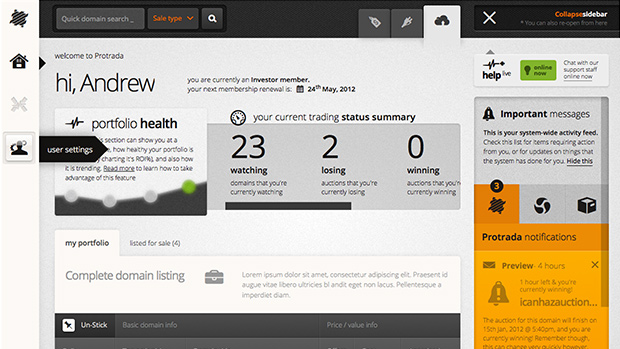
This in mind, I started to work with what we now call ‘panels’, to replace a lot of the modal-based functionality and flows. Panels give forms more room for content and functionality which will help us minimize unnecessary clicks, and allow for more helpful instructions and hints.
Another advantage to our panel UI component, is that we were able to integrate some system wide memory/logic around them, which is now able to track a users movement / interactions across the system, and restore the state of the UI (panels, UI settings and much more) to exactly what they bounced out of the system from. This was also a major sore point for v2, as users commonly have to repeat tasks if they either lose connection to the internet, go inactive for too long, or suffer an application failure during mid-task operation.
a new, better grid for data display
If ~70% of Protrada v2‘s functionality is inside of a modal window, ~25% of the remaining functionality can be found inside of the grid data controls.
Protrada uses grids much like they are an online version of excel. They allow users to filter, search & sort a tables of all different types of data. In the Exchange there are millions of domains that can be accessed with various data attached to them so it is important to allow users to filter this data inline, as well as through other features like advanced search etc. This means, that instead of performing a search, deciding to alter this search and start again after seeing zero results – a user can now refine, edit, or completely shift search criteria interactively through the grid controls.
My new, improved grid control prototype also comes with some handy UI behaviors built in, such as thead snapping on large data views and snapped horizontal scrolling. Thead snapping, essentially means with a single flick of the finger (on a touch device or a magic mouse) – our UI becomes a fullscreen interactive spread-sheet, allowing users to view much 2 or 3 times more data at any one time. We introduced horizontal-scroll snapping in an effort to combat the annoying necessity of tabular data displays, to scroll to the bottom of the table before access to the native horizontal scrollbars is granted.
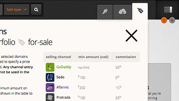
bulk editing functionality
Something I’ve learnt throughout the development of v2, is that bulk operations for just about every domain-related procedure is an absolute must, if we’re to cater effectively to users with large portfolio’s of domains (our target audience!). In v3 we have paid particular attention to these processes to make them as user friendly and as fast as possible. By introducing csv imports for most bulk operations we can allow owners to quickly tell Protrada to perform functions on their behalf.
A lot of care has also gone into ensuring that bulk functionality inside of the data grid views is not lost at the bottom of the table. Now, when a user ‘tick’ selects more than one domain, the bulk functionality menu appends itself to the thead, inside of a table row – ensuring it’s visible at all times during scrolling.
mobile and responsive
Another huge ambition in my production of the v3 prototype, was the desire to create an app that can evolve to perfectly use any device’s form-factor, regardless of size – rather than just simply being accessible on a couple of different, though specified devices. To achieve this I’ve deployed a large amount of @media responsive css, and a tiny amount of UA sniffing to help de-tune UI features and refit the layout/components to any given form-factor/size.
I also built these styles / functionality, so that they can be in-acted manually by the user, from a global system menu, at the top left of the screen. For example users on smaller, less powerful devices can now de-tune their UI to remove shadows, gradients and unnecessary UI embellishments, to enhance application performance and usability on low resolutions.
In order to ease the transition into near future high pixel density displays, whilst also enabling savings on performance and bandwidth, I’ve deployed almost every single graphic asset used by the app’s UI – as a single @font-face icon font. This has enabled us to save eon’s of time in pain-staking spriting / image asset production – while also making less http requests and requiring less bytes to be sent to the user.
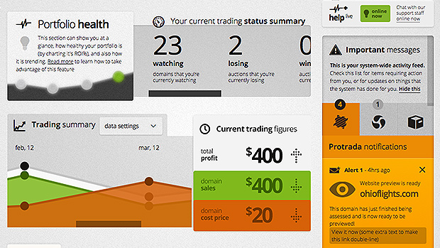
alerts and notifications
After learning from our experience with the ‘Alfred’ help/comms layer in v2 (placement of objects position: fixed to the bottom is extremely problematic, for one..:p) – this functionality is completely reinvented in v3. Kept in a toggle’able sidebar, our notifications and alerts system now contains tabbed list views of notifications that appear as they happen, through use of socket.io and node.js. When closed/hidden, the users can still see if new alerts are coming in, through the notification total bubbles in the top right of the layout.
Alerts and notifications will now be a lot more helpful and specific, as I have designed into each of them the ability to display a corresponding action, required of the user. Once dismissed from this list, all msgs and alerts are then archived, allowing the user to go back in time and double check items that they may have overlooked or dismissed.