glo - motion + ux
just a
glance ...
like many digital designers, my career began as a print based designer. over the years however, i have definitely developed a passion for all forms of digital design media. because of this passion, my folio is mostly dedicated to these mediums, however if you would like to see more offline / printed design work, just drop me a line.
jcca intranet – tablet / ipad layout
project critique:
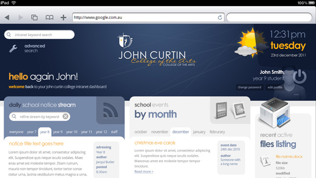
Although the two technologies use similar resolutions (at least when an iPad is orientation: landscape), good design for handheld devices requires some very different thinking, compared to conventional user experience for laptop/computer based design. Upon beginning the process to create iPad/tablet based layouts from the current conventional JCC intranet mock layouts, one key difference in layout methodology started to become apparent to me.
In conventional design, because a movement of a mouse can be controlled so accurately in selecting items on the page (down to almost pixel for pixel accuracy) web design often entailed fitting a lot of information on the first screen fold, ensuring that said content would be visible without the user having to go looking for it and scrolling down the page. I was always in 2 minds about just how familiar web users are with scrolling down the page, and often tried to influence my clients toward spacing things out more, increasing text size and creating more white space – aiming for some kind of middle road between two extremes. Having said this, quite often in commercial ux design, it was hard to convince some clients of the merits in such an approach and hence designs often end up being squished so that the bulk of them fit In the top screen fold of the design (at least for the most common resolution size to render the website).
. . .
Tablet and other touch based devices seem to reverse this trend however – instead interfaces and ui elements need to be treated more carefully regarding whitespace and size. Buttons need to be bigger, and interface elements need more space around them, so that they can be touched without risk of accidentally touching another element and so on. Of course this approach inevitably sacrifices the amount of content that is immediately available to the eye upon page load (without scrolling) – but this is not the end of he world, and almost definitely the lesser of two evils. The reason I say this, is that, scrolling on a touch device is so much more natural (at least to me), than trying to point out, read and interact with ui elements that are smaller than my (somewhat wide) fingers.
Applying this methodology to the iPad version of the jcca homepage, I began laying out a similarly structured mock, this time with an emphasis on enlarging interface elements – consequently lengthening the page layout to be two or three fold, instead of one and a half. Inline with this, I removed the navigation from the header and instead created a bottom navbar more akin to iPad applications. As fixing the nav bar to the bottom of the screen using position:fixed, isn’t possible on mobile webkit browsers due to the way they handle overflow:scroll, a small amount of simple JavaScript (along with a plugin called iscroll) may be needed to achieve this. The removal of the navigation from the header enabled the welcome customization to be moved to the header area, and allowed me to remove the entire personalized row, freeing up some much needed available height.
launch project »
For the orientation:landscape layout I decided to keep the three column layout, as 1024px is more than enough width to display three columns of information, and readability can start to decline the longer lines of text get in width. To keep things simple, the page layout clean, and unnecessary image downloads low, I did away with the drop shadows on either edge of each column.
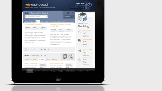
For the orientation:portrait layout, instead of simply allowing the default ipad functionality to zoom out and show more of the page’s length, I decided to vary the layout slightly. Replacing the two wide columns and one thin column, I Stacked the two wide columns on top of one another, which allowed the text size for the whole page to stay the same, thus not compromising readability in either orientation mode. Reverting back to a two column format also enabled me to display two articles alongside each other at a time, whilst not sacrificing space or text size, and increasing readability (I found the two columns of text easier to read than one wide column).
Due to the massive reduction in available width, the portrait mode logo area is designed to revert back to a simple logo motif, separating out the logo type so it can be reduced down and redeployed to the top left column.