glo - motion + ux
just a
glance ...
like many digital designers, my career began as a print based designer. over the years however, i have definitely developed a passion for all forms of digital design media. because of this passion, my folio is mostly dedicated to these mediums, however if you would like to see more offline / printed design work, just drop me a line.
jcca intranet – laptop / computer layout
project critique:
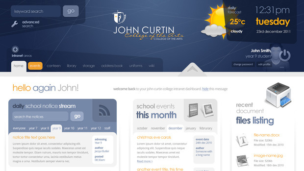
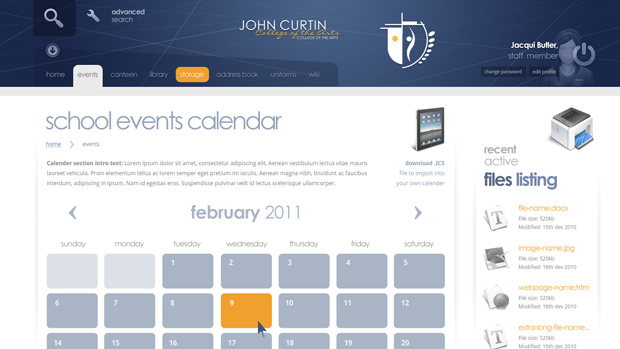
As with many intranet development projects, the John curtain college intranet was designed to be functional, yet friendly to it’s intended target audience (all school staff and students) to encourage frequent use, contribution and active collaboration. It was also to strongly follow the designated style guide and aesthetic that was adopted for the public website, some years ago – the faint diagonal lines and color scheme are all derived from the existing jcc brand.
The target technology of this intranet is centered around Apple products – namely MacBooks, MacBook Pro’s and iPads (as this is what the school is choosing to provide for all staff and students). Because of this, I was able to take advantage of a lot of new technology (CSS3, HTML5) without the extra work required to avoid less-than-graceful degradation in Older browsers. Also, given that when viewed on a computer, this intranet would most often be viewed in wide-screen (as the apple laptop offerings all come with a wide-screen (1280px) format monitor) I opted to use a fluid 1140px grid system layout, which can shrink down to a min-with of 990 if necessary, to accommodate lower resolutions.
Using the current John curtain college website as a starting point, I then began to consider a homepage that would focus the student/staff members attention, introduce the most important of the intranet’s functionality as a high level summary (according to the client these were to be daily notices, a comprehensive event display system and a look-in to recent file activity, allowing the dashboard to act as a simple snapshot for all the work that each staff member / student is currently engaged in) and provide simple access doorways deeper into core site functionality.
. . .
Starting out in the design process, I decided from the beginning that (similar to the public site) the header should be bold, well spaced out, and ideally personalized by whoever is looking at it. This accompanied by appropriate amounts of meaningful content, would help in capturing the browser’s focus, which of-course is a common kpi in most application / website’s home pages. It was therefore my intention to make this area the focal point of the page layout. Where possible, I tried to stay true to usual ui conventions (logo top left/center, user functionality top right, search top left) as this is what people are used to when interacting with digital interface, seeing little reason to move away from the norm.
Also In keeping with the intention to keep the interface friendly, where possible, I have also tried to keep buttons and interface elements large and rounded – these characteristics I often find synonymous with friendly, informal layouts, such as Vimeo, to state one example.
Working n the header area if the layout, It did dawn on me that some users (perhaps even all frequent users) of this intranet will most likely choose (if given the choice) a smaller, more impact header area, to allow more space for the real content of the site/app/page. To make allowance for this, I thought I would use some simple jQuery to include some functionality that empowers users to further customize their dashboard, by toggling the display of the header and welcoming messages, and saving that state through use of cookies.
For example, When the arrow button is interacted with (which will most likely need to be coupled with some hover pop-up jQuery enhancement, to make its purpose clearer), the header could revert to something more akin to the proportions of the internal page design.
launch project »
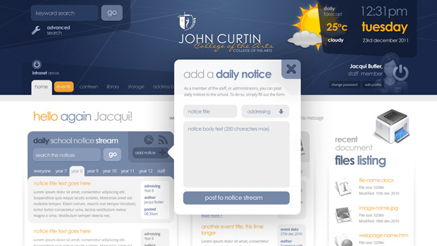
Following from the header area, it was my intention to draw the eye downward to the next most important area, the dally notices board stream feed. I waned this area to stand out amongst the other content areas, as this was one of the more important functions of the intranet. giving it a solid Grey/blue head, seemed to give it the emphasis needed, to move the eye down the page from the header area, into the page’s main content area. I thought it advantageous to treat the first notice in this listing as special, to help highlight what might be considered the most important notice in the stream, the most recently posted item.
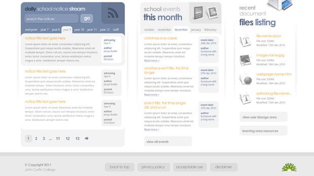
Continuing with the layout, I intended to configure the hierarchy and coloring of the headings to further maneuver the eye across the to the other areas of functionality in this layout, the school events and recently used files section. To avoid clashing too much with the flow of the eye, I kept the listing data relatively low-key and neutrally colored, as I have often found that using harsh black on white can sometimes create visual noise in page, which can in turn confuse the intended movement path of the visitor’s eye. Legibility is still paramount however, which is why I chose to use a contrast ratio of xx:xx (recommended for maximum legibility) for the various areas body/article copy.
The footer was designed to gently seal off the layout, thus I only slightly varied its background tone, to that of the main content area. I have tried to keep the footer as useful however, offering a navigational aid to auto scroll users back to the top of the page.