glo - motion + ux
just a
glance ...
like many digital designers, my career began as a print based designer. over the years however, i have definitely developed a passion for all forms of digital design media. because of this passion, my folio is mostly dedicated to these mediums, however if you would like to see more offline / printed design work, just drop me a line.
protrada (v2) re-skinning work
project critique:
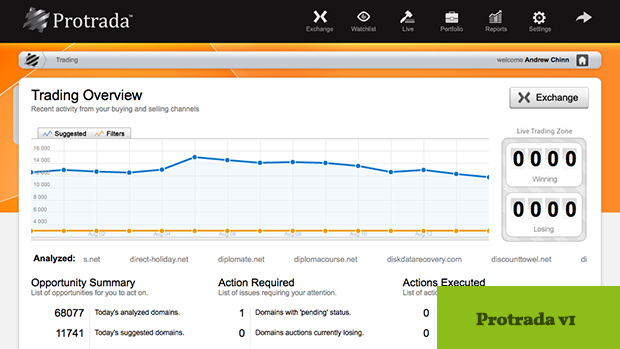
When I first joined Winged Media, I was tasked with cleaning up, and applying a new visual skins UI layer to what had become a slightly inconsistent and erratic visual interface (pictured above). Not included in the scope of this project however, was any task that entailed changes to the overall underlying framework / controls, thus improvements in the UX of the product were a little hamstrung by technical constraints (PHP/Zend, Fixed width to 960px, centered, large use of the DHTMLX Grid etc).
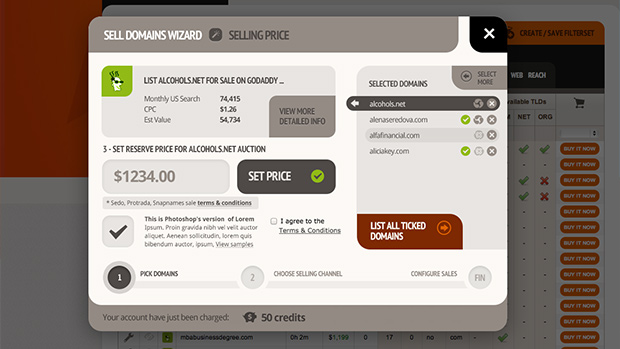
This project involved a very heavy reliance on modal windows for cross-sectional functionality, thus a large portion of my time was spent creating dozens of intricate modal
. . .
layouts which needed to display a wide variety of functionality inside of the relatively small container (usually around 700px x 500px) of a modal window. An important consideration here, was to keep internal scrolling to a minimum – so most user task-flows etc had to be split up into several steps – resulting in wizard like task processes.
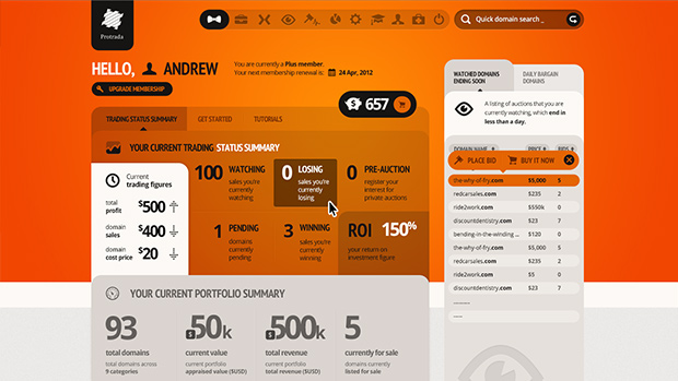
In the UI of this project (which we dubbed Protrada v2), I tried to use the limited available space as best I could, compressing up things such as navigation and branding, whilst still endeavoring to maintain a balance of healthy negative space – to try to prevent the UI from becoming overly complicated or ‘busy’.
launch project »
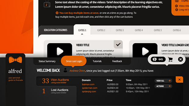
Lastly, in Protrada v2, I was tasked to try and include (using a ‘bolt-on’ style approach) and integrated communications and help layer to the interface (which we ended up calling/branding ‘Alfred’). Sadly, this area (like the rest of the project) was a little limited by the technology driving the system, and also never quite got the dev time that it needed, thus the end result came off as a little half-baked and superfluous. This area was designed to be a real-time assistant to users as they performed tasks in the system, giving them various sorts of visual ‘objective completion rewards’ and alerts/notifications when things they have set in motion are in need of their attention.