glo - motion + ux
just a
glance ...
like many digital designers, my career began as a humble print based designer. over the years however, i have definitely developed a passion for all forms of digital design media. because of this passion, my folio is mostly dedicated to these mediums, however if you would like to see more offline / printed design work, just drop me a line.
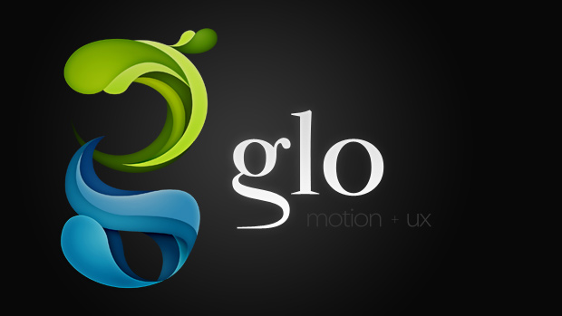

glo motion + ux brand
short description:
This logo was nothing but a passion job for me. At the time I wanted something with which to brand my newly conceived WordPress folio mash-up, so I began searching for inspiration that suited the dynamic, ever changing nature that is potentially, a WordPress powered website.
Aural lights have always interested me as a visual person, the science behind them, the many variations that they come in and the amazing colour combinations they spawn momentarily all throughout the dawn skyline. This long-standing curiosity of aurorae, also seemed like a nice fit for what I was trying to achieve in my new identity online. Thus, coined from auroras themselves, the name “glo” was born (i then added the ‘motion + ux’ words in an attempt to offer atleast a tiny bit of affordance to the name … :P).
. . .
To my amazement, several versions of the ‘glo’ domain were available straight up (an occurrence thats increasingly rare nowadays), so without delay, I promptly reg’d myself a cheap glo domain, and this became the central focus behind my new brand, and the website it was designed for.
Designed to aesthetically encapsulate the beauty of auroras, the glo ‘g’ is formed from flowing shapes made of natural blues and greens, in an attempt to capture the appearance of luminescence and movement.
snapshot details:
- Logo
- Stationary
tech used:
- Photoshop
- Illustrator
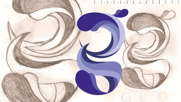
- Pencil and Paper